Sunday, November 29, 2009

Type assignment!

TYPE ASSIGNMENT :


When I first got the brife about he type assignment I tried to think in big picture terms,

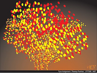
how is it going to be, what color do I want to present? I started by thinking word by word and brainstroming step by step until I got an idea to present and interrogate each word's meanings by using line, tone, colortexture, etc. I have tried to connect four ideas together and came up with the concept ' GLOWING IN THE DARK '


Moma!


I was cleaning and arrange all my files from my laptop and I found some pics which I really like the idea. About 4 month ago before I moved to Ireland , I was in New york city. I went to the Moma ( Museum of Modern Art ) . I remember that when I was there on the second floor in Moma. I saw many people stayed in line for some reason after that I looked at inside the room and didn't understand what was that going on? My friend and I decided to stay in the line and wanted to know what was going on inside.?

Finally, when I got inside the room, I was amazed and love the idea of the project so so much.
The idea was when we were young and our parents kept checking how tall we were every year, to see how develop of their child. That was the idea of this project,so they opened for anybody who came to visit Moma put their height and date of birth on the wall. At that time when i was there, it became a piece of art project on the wall which was incredible as you can see from the picture.!!

WOW so awesome.


Saturday, November 14, 2009

I love Helvetica....!


Helvetica,

First of all, I have to say sorry for not blogging during past a few weeks because of some network problem but I am back !

Every typeface, like every one of us, has its distinguishing features.

Helvetica is a popular choice for commercial wordmarks. It looks clean and has a beautiful shape which look already perfect in any words.

I normally choose font which look very simple and easy to communicate with every work I have done. I have no idea before about their history until I had a chance to watch a film name” Helvetica” in my Vis communication class and it surprised me a lot!

As in the film show we can see many signs /ads etc.used Helvetica. I never realized how popular of Helvetica which have a big impact to our society. Helvetica is one of the most popular typefaces of all time. It was designed by Max Miedinger in 1957 for the Haas foundry of Switzerland (the name is derived from Helvetia, the Latin name for Switzerland).

I have another one example of how simple but look good and perfect in one lay out with Helvetica on the top. Even though in the same lay out mix with different kind of Helvetica styles ; bold, medium,roman,light etc.